Brand Identity · 2026
Aura of Happiness
A warm, welcoming identity for a family & outdoor photographer.
What this project is
Aura of Happiness Photography is a West Rand family and outdoor photography studio. The brief was a full mini identity — logo, colour system, and a small suite of applications — that felt as warm as the photography it was built to represent.
The challenge
Give an independent photographer a mark and system that reads playful, colourful and heartfelt, and holds up whether it's printed on a business card or cropped into an Instagram grid.
Creative direction
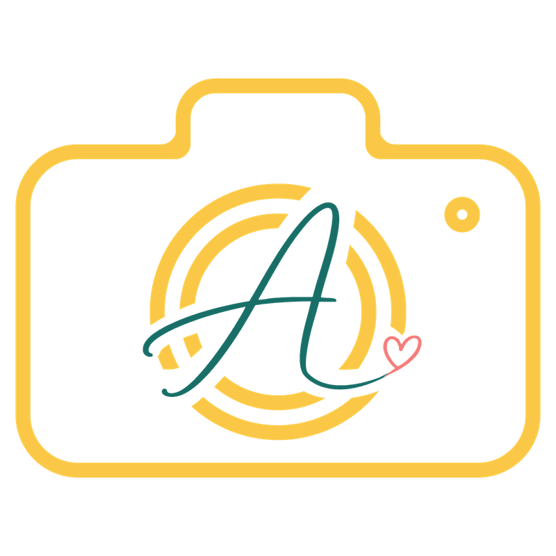
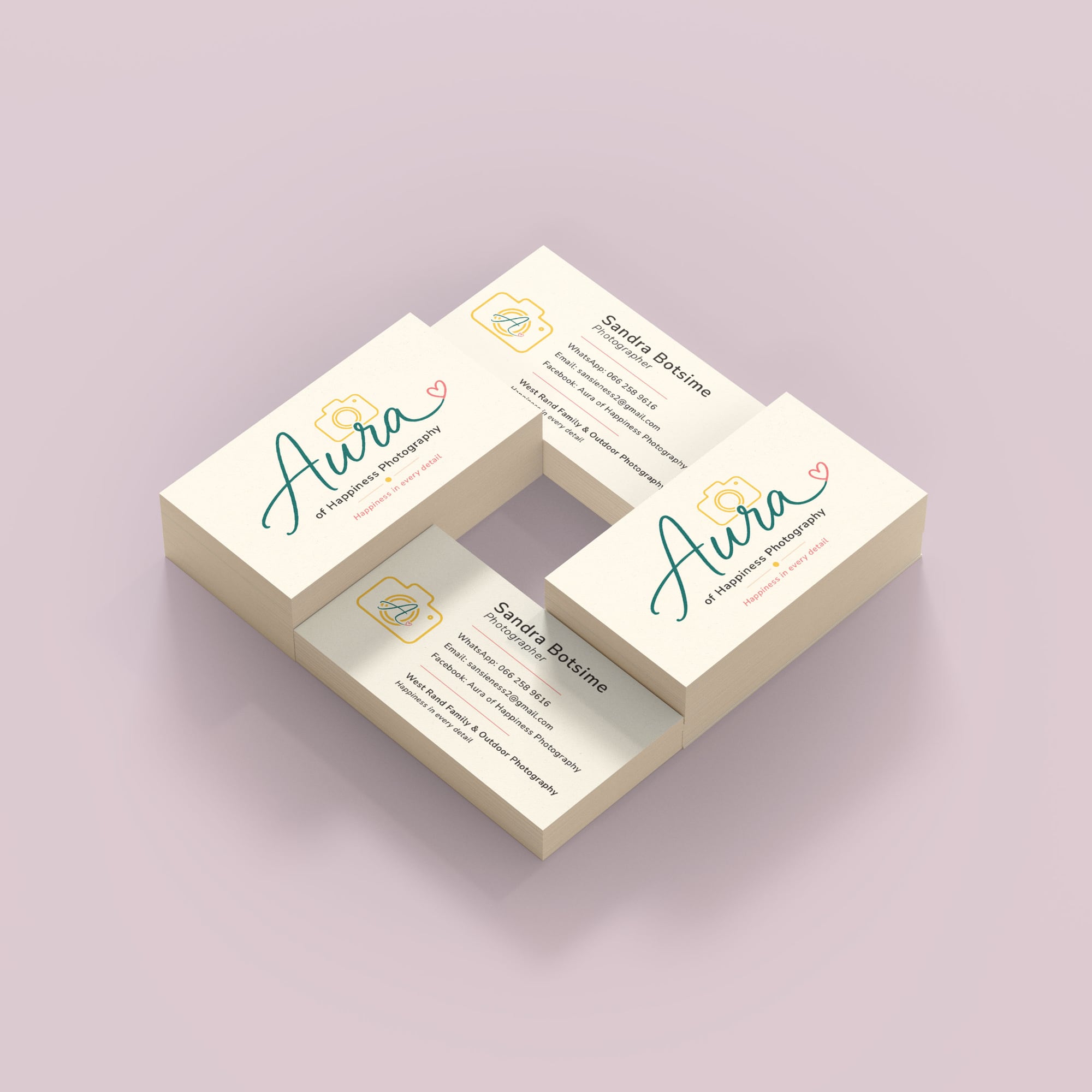
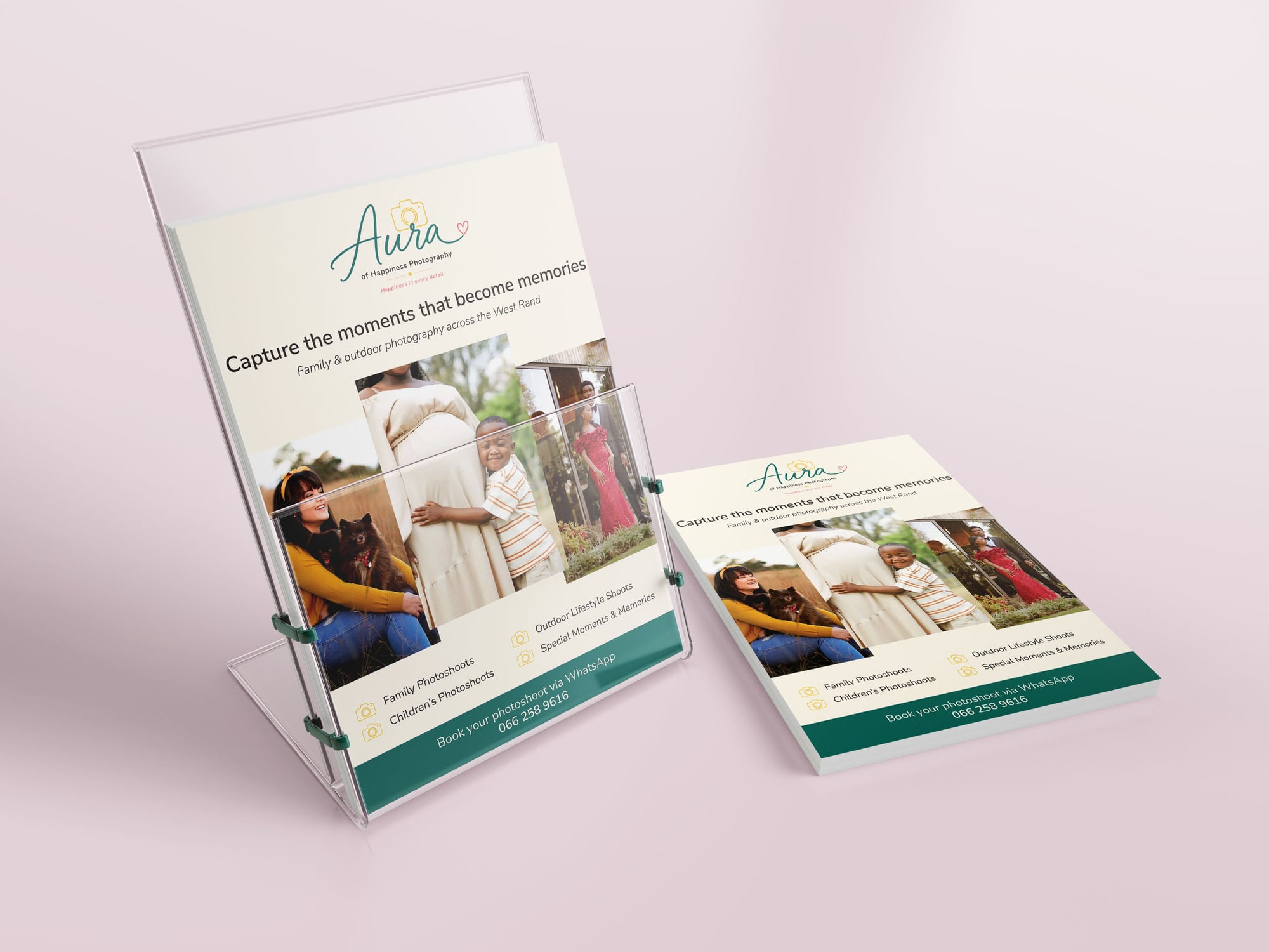
A hand-lettered 'Aura' script pairs with a simple camera-and-heart icon, so the logo works as a full lockup or a standalone profile mark. The palette — warm teal, gold, coral — was pulled directly from the studio's own family photography, so brand and portfolio feel like one continuous world instead of a logo bolted on top.
How it came together
The mark
A primary lockup, an icon-only version for profile photos, and black/white variants for print — built to survive every context a small photography business actually needs.

Applications
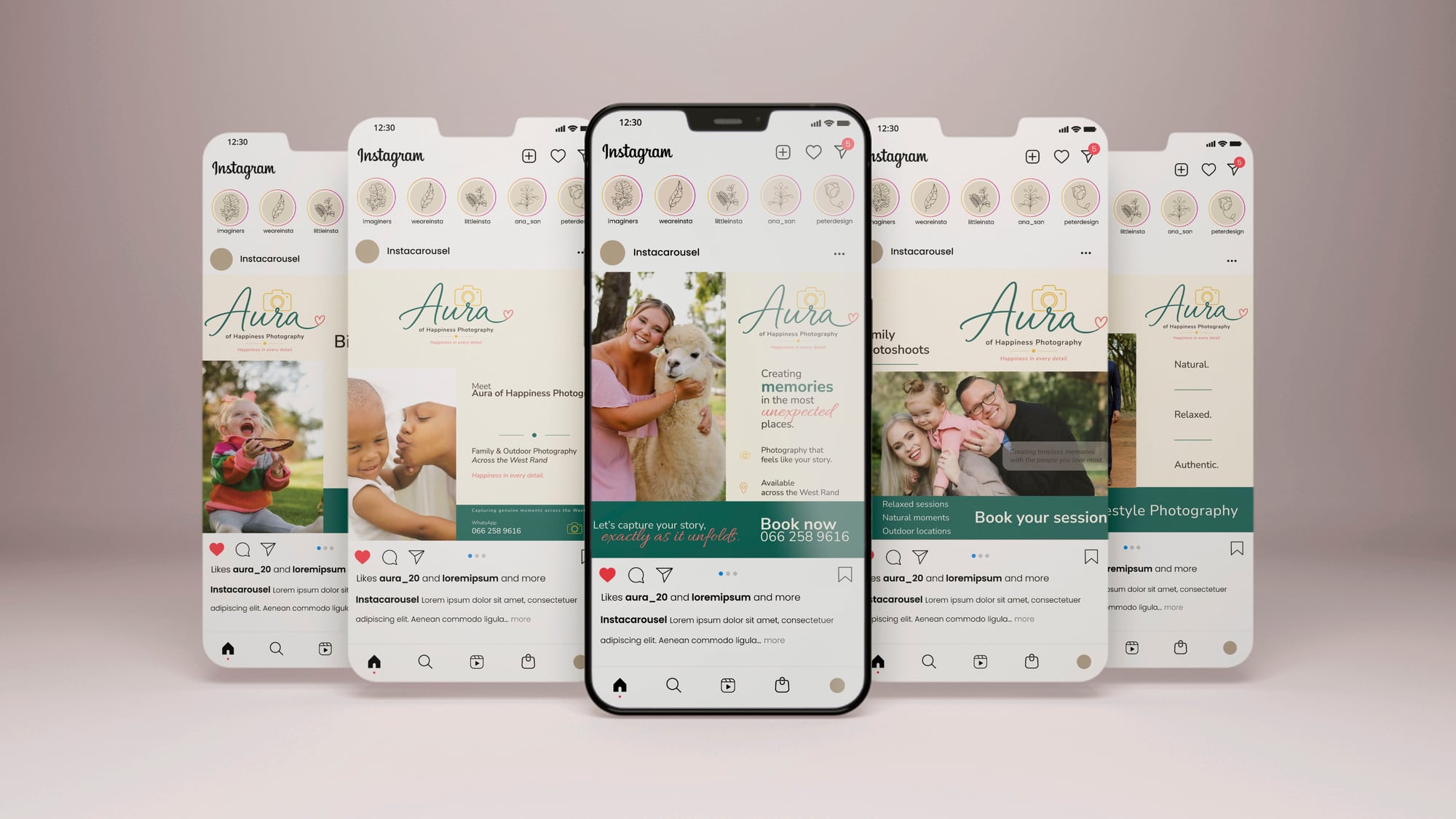
Business card, promotional flyer, and Instagram templates, all built from the same colour and type system.
Happiness in every detail — the studio's own line, and the brief the whole identity was built to answer.