Product & Web Design · 2026
Crimson Vixen
A tactical playbook website for a competitive CS2 team, built dark, fast, and gated to the roster.
What this project is
Crimson Vixen is a personal project: a dark, tactical playbook website built for a competitive CS2 team — a home for team strategy and identity, designed to feel like a genuine competitive tool rather than a shared document dressed up.
The challenge
The content needed to stay genuinely private to a small roster, without the usual cost of 'private': slow logins, shared passwords, or a clunky gate bolted onto the front of an otherwise considered site.
Creative direction
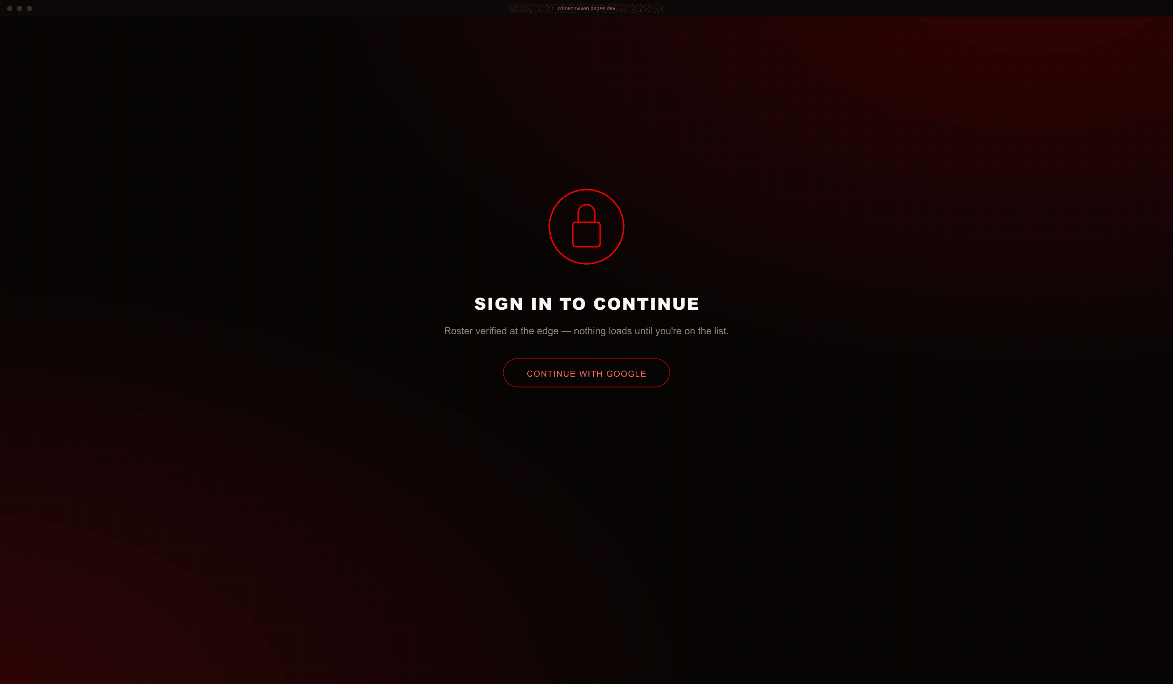
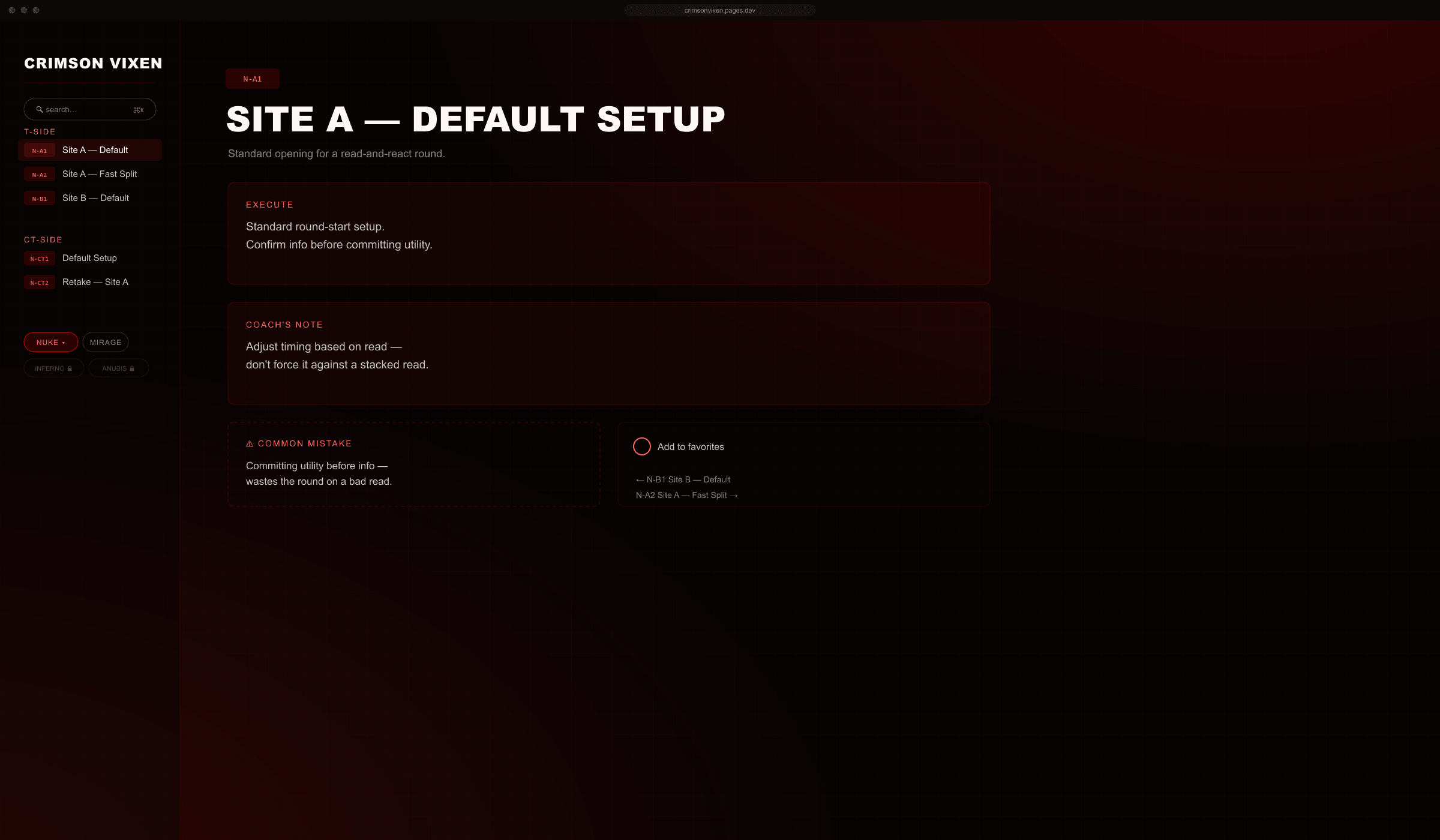
The whole interface commits to one mood — near-black backgrounds, a faint tactical grid, and a single red accent used sparingly enough that it still means something when it appears. Every strategy page follows one consistent card system (execute, coach's note, warning, drill) so structure never gets in the way of reading a play quickly under time pressure. Access itself became part of the design: signing in is one click, roughly once a month, and anyone off the roster sees nothing at all — not even a login screen with the team's name on it.
How it came together
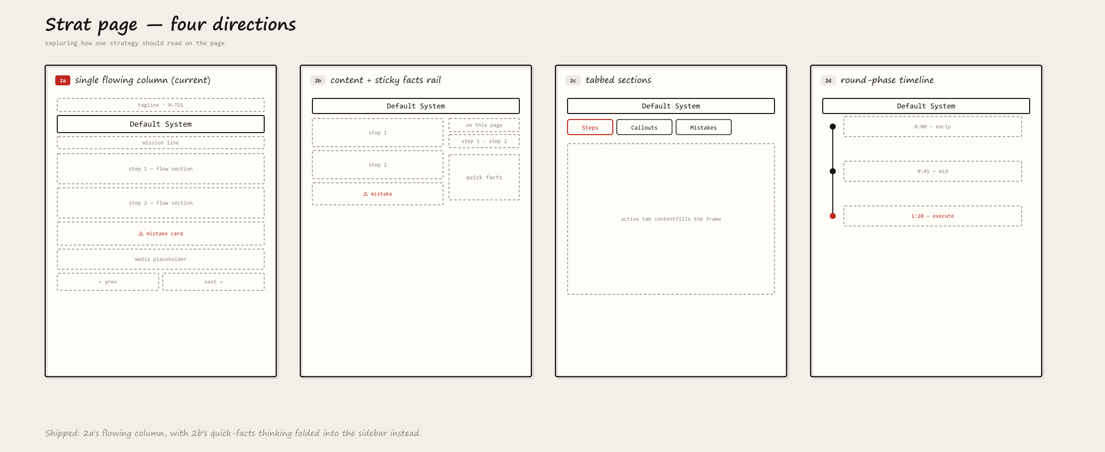
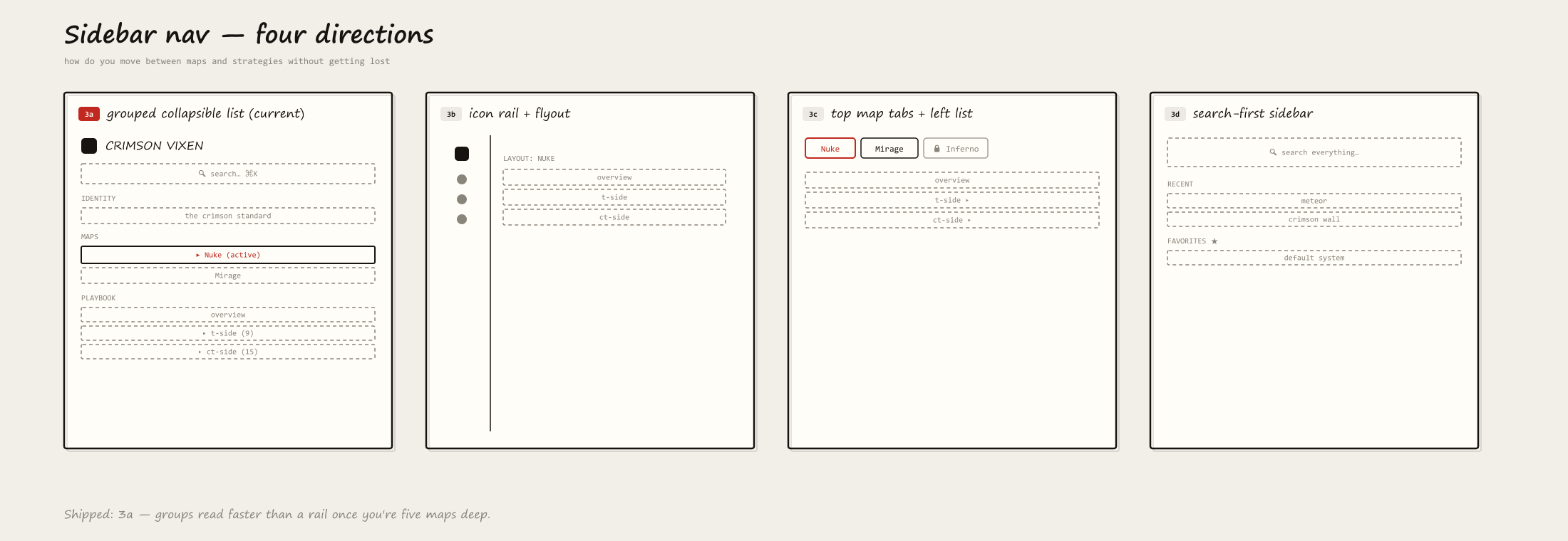
Wireframes came first
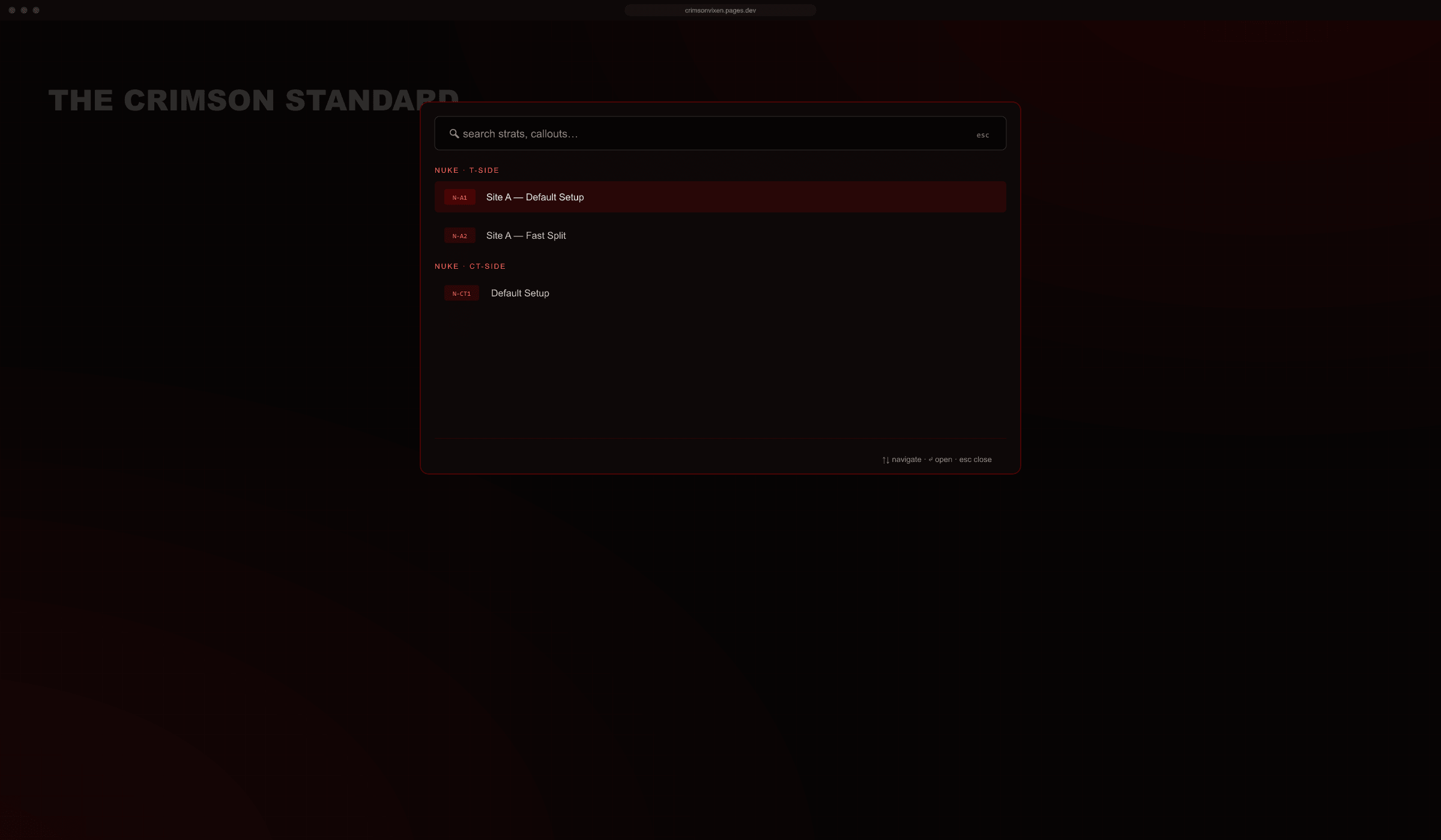
Every screen went through several structural directions before a single pixel of the real interface was styled — sidebar navigation, the strategy-page layout, the search palette. The goal at this stage wasn't to look finished, it was to argue about structure cheaply, before code made changing your mind expensive.
The interface
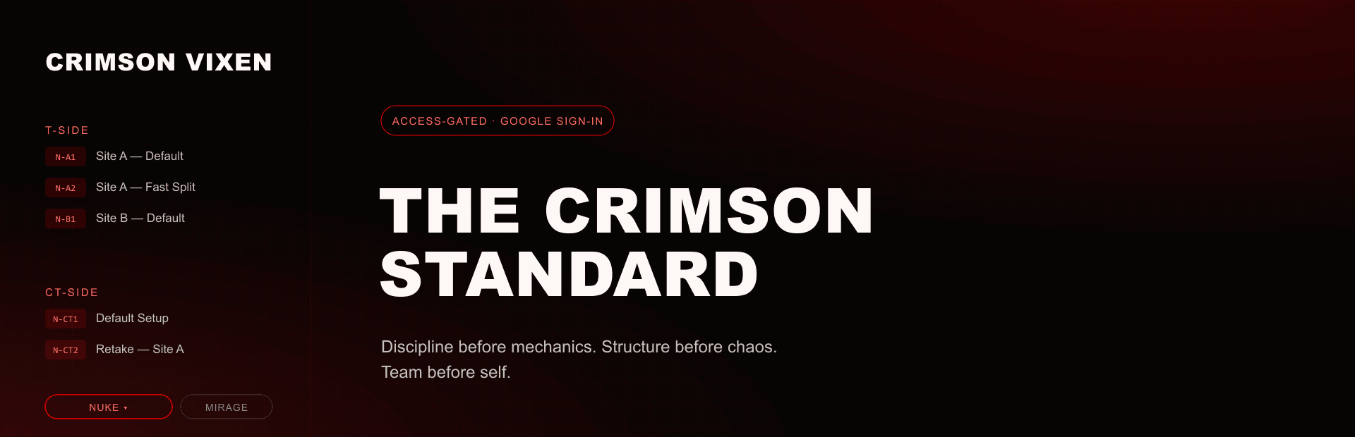
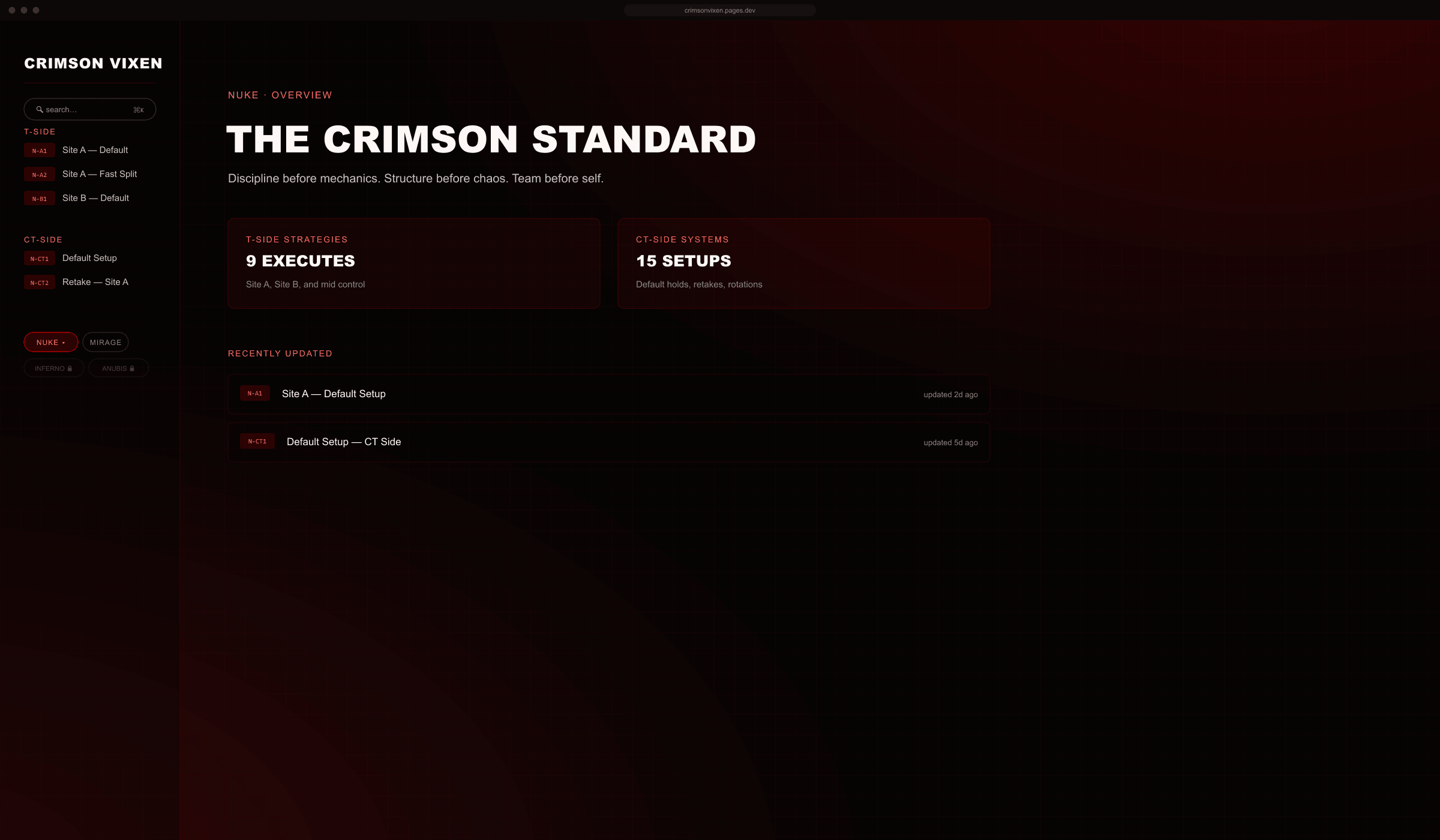
A persistent sidebar for moving between maps and strategies, and a consistent, colour-coded card system for every play — built to be read in seconds under time pressure, not studied. (Content shown here is placeholder, standing in for the real roster's strategies.)
Sign-in is one click. The roster, the gate, the architecture — all of it happens invisibly, at the edge.